Posts Tagged ‘From the painting desk’

h1

From the painting desk #27 – Knifehead

May 3, 2014

After painting two jaegers, it was time to tackle a kaiju – they obviously need someone to fight. The first mini in my monster queue was Knifehead, a kaiju from the Pacific Rim movie.

Click for a larger version

Click for a larger version

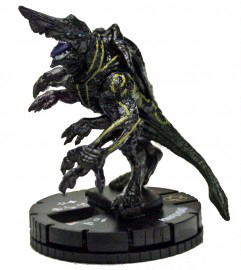
The miniature for it is a Pacific Rim Heroclix one. I forgot to photograph it before painting, but here’s a catalog image:

knifehead

Painting Knifehead was very different from painting the jaegers. The machines are all straight lines, flat surfaces and clean, bright colours, whereas the kaiju has plenty of texture and organic shapes. This was sort of reflected in my painting of him, as I went for a more irregular layering (read: not as neat), did some drybrushing and used several washes. The end result is very different from the jaegers both stylistically and in feel, and I think it was a good call as it accentuates the whole organic vs. mechanical setup. It also had the benefit of being super fast – the whole mini probably took me a few hours from start to finish.

While I liked the colour scheme of Knifehead and the rest of the kaiju in Pacific Rim, I wasn’t too fond of all the bioluminescent markings, so I did away with them. Instead I went for a blue-green scheme, almost looking like verdigris. In fact, in it’s early stages the model looked a lot like a statue. Again, the tones are very different from the jaegers’. While obviously straying far and white from the canon (schmanon), the end result was worth in my opinion.

As you may know, I like my bases very simple. This time, however, I added a little extra touch in the form of a tiny tank. Instead of completely flipping it over, I just positioned it at an angle that suggests its toylike insignificance compared to the kaiju.

You might have noticed that I seem pretty happy with Knifehead. I am! I was very sceptical of it at first, it being a clix repaint, but I was happily surprised with the end result. There are some awful, awful mould lines there, which I didn’t clean (“Come on, it’s a vinyl clix mini, not worth the hassle, let’s just get it on the table”) but even those don’t show up too badly.


h1

From the painting desk #26 – Seeing red

April 30, 2014

Another miniature done! Not completely happy with my previous jaeger, I decided to pick a colour I was much more comfortable with – red. I went to work on another Reaper CAV miniature, Hawk. I wasn’t originally too impressed with the mini. I thought it was boring and looked like a generic Transformer. Nevertheless, I started painting it and slowly it grew on me. Now that it’s finished, I’m really happy with it. I spent more time than usual on layering and washes, and I hope it shows!

Click for a larger version

Click for a larger version

Inspiration for the colour scheme was another jaeger from Pacific Rim, Crimson Typhoon:

crimsontyphoon

While I would’ve loved to add some fancy freehand detailing, I’m simply rubbish at it. I settled for a few yellow transfers that I painted over a little and added a few dots to make it more interesting, and I think it doesn’t look bad at all. This also stylistically ties it together with the first jaeger I painted. I would’ve loved to paint on some weathering, but in my game setting the kaiju action is only just beginning, and the jaegers have yet to face any – hence no battle damage.

With the first two jaegers painted, it’s time to tackle the first kaiju. Comments and constructive criticism always welcome!

h1

From the painting desk #25 – Kaiju hunting

April 24, 2014

The first mini I’ve finished in a long, long time is a CAV mech, Spitfire, from Reaper Miniatures. My painting skills and patience had rusted a bit, but the end result is still reasonable. White is a pain to paint, and I could have done a better job here, but eventually I decided to just be (somewhat) happy with it and move on to another miniature. And hey, I now have the first painted mini for my Pacific Rim project.

Click for a larger version

Click for a larger version

I drew inspiration for the colour scheme from Tacit Ronin, a Mk. I jaeger in Pacific Rim, which can be glimpsed in the film’s introduction sequence:

tacitronin2

with the colour scheme nicely shown in this piece of concept art:

tacitronin

While painting the model wasn’t as fun as it could’ve been, finishing it sure was! The next one is already on my table and well on its way. This time I’m painting my favourite colour, red. I guess painting with your favourite colour is the miniature painter’s comforting chicken soup.

h1

From the painting desk #24 – Ethnic diversity

September 22, 2013

Finished another three of Pig Iron’s Heavy infantry. I hate batch/assembly line painting, so I try to do my best to keep it interesting. This usually results in me adding different ethnicities in units. It not only makes the unit look more interesting, but also better reflects real world and my scifi visions. While WH40K’s Space Marines might be a race of genetically enhanced super-Aryans, I like to make my units a bit more multi-cultural. To illustrate, in 2008 Black and Hispanic members made up over a third of the US Army, and I think the diversity has been, is and will be on the increase.

Realism aside, it serves to break up the monotony of a unit wearing the same armour and BDUs. In the latest group of three, I picked three different skin colours. One was my regular caucasian skin tone, one a reddish mid-range brown and one a very dark brown.

Click for a larger version

Click for a larger version

In my opinion the end result is quite nice, what do you think?

h1

From the painting desk #23 – OPFOR

September 7, 2013

I’m slowly getting my painting groove back on, which means I finally finished a few models. They’re both Heavy infantry by Pig Iron Productions, a part of their mighty fine science fiction range. Like most of my scifi stuff, they’ll find use in my Utopia project. The Pig Iron minis will represent the heavy infantry of the Outer Colonies, a counterpart to the UTOPIA troopers the players are commanding.

Click for a larger version

Click for a larger version

Click for a larger version

Click for a larger version

I used the casualty miniature to test the colour scheme. I wanted something very down to earth, so used a combination of browns and grays. In order to keep them from not looking too monotonous, I added a simple horizontal stripe camouflage. Another reason for the simple camo choice was that I wanted to keep these guys quick to paint. A lot of both models is painted using drybrushing and washes, with scratches in the armour and the camo adding extra detail. The casualty won’t be based, I just put him on a base to ease photography.

A special mention must go to the flag patches. To go with the typical “opposing force is always red” mentality, I was about the make the flag red as well. Luckily I decided to ask a non-gamer friend what she thought would look cool. “Maybe try green, with some yellow?” she said, and that I did. I love how it turned out, as the green really pops from the muted overall look.

The Pig Iron minis are a joy to paint. They have a lovely simplicity to them, reminiscent of Mark Copplestone’s work. As Mr. Copplestone is one of my all time favourites, this is high praise indeed.

As always, comments and critique welcome!

h1

From the painting desk #22 – Security!

June 26, 2013

I recently bought some lovely Time Lift Security miniatures by Crooked Dice. Destined to become generic near future security guards (who will show up in a Utopia game report later), I gave the models a very toned down, dull look with khaki vests over grey overalls. To keep the models from getting too dull, I added some white in the form of the vest collars and belts. I think it gives them a bit of a retro look and nicely breaks up the otherwise low-key paint scheme. To add some ethnic diversity, I painted one of the models using very different skin tones. I would’ve loved to paint a few using darker skin colours, but the hairstyles and facial features simply weren’t suitable for that.

Click for a larger version

Click for a larger version

Click for a larger version

Click for a larger version

The models themselves were easy and quick to clean up and paint. They’re very neat little sculpts and I think they turned out pretty characterful. You can get them direct from Crooked Dice.

Comments and critique welcome!

h1

From the painting desk #20 – Synth pop

December 1, 2012

My ongoing game project is providing me with loads of painting inspiration. Here are three models I recently completed:

Click for a larger version

Click for a larger version

The models on the left and right are from Victory Force miniatures, from their not-Star Trek range of space explorers. While (or because) they have have very short arms and big heads, they’re very characterful sculpts and were fun to paint. The one in the middle is a not-Bishop from Woodbine’s scifi range. As with other Woodbine models, the style is quite cartoony, making the model easy to paint. These were quick paintjobs, and I’m happy with the end result.

Androids feature heavily in the Alien franchise, so I thought it only appropriate to include them in my games as well. This trio featured in the second game of the Utopia campaign, where they were the assistants to a Weyland-Yutani scientist.

The simple paint scheme is based on the blue-grey overalls worn by Bishop in Aliens. They also tie these synths in with me previously painted combat synth.

Comments and critique welcome as always!


h1

From the painting desk #19 – Two more for the corps

October 28, 2012

Some painted stuff for a change, with yet more troopers joining my Colonial Marine/generic scifi force.

The first is another one of Defiance Games‘ UAMC marines. While the crispness leaves much to be desired, they’re still fun to and simple to paint and make for a nice addition to the force.

Defiance Games UAMC marine

Click for a larger version

The second mini is a different story altogether. Hasslefree Miniatures‘ McKenzie has been a favourite of mine since I first saw pictures of the green on the FU-UK forum years ago. You know how some miniatures are just so nice that they almost intimidate you into not painting them? That’s what happened to me here. Eventually I managed to tackle the task and I’m very happy with how the model turned out. It’s a great sculpt, with plenty of detail without getting too cluttered. I also think that the Colonial Marine paint scheme fits the model something lovely.

Hasslefree McKenzie

Click for a larger version

As always, constructive critique and other comments more than welcome.

h1

From the painting desk #18 – A not-purple worm

September 22, 2012

After reviewing the Reaper Bones purple worm I was left with a sloppily washed model sitting on my desk. Since it was already somewhat started, I figured I’d paint it up properly. Not really wanting an actual purple worm, I went for an earthy palette for the colours.

As tends to happen to me, I was very lazy with the mould lines, and they ended up showing a bit too much for my liking. Something I might add to the review: on the soft plastic the mould lines are somewhat difficult to remove. Filing results in a mess, cutting easily takes away to much and scraping works, but not as well as with hard styrene. Of course due to the worm’s round surfaces and textures, mould line removing was more difficult and time consuming than usual.

A question has been raised on the nets about whether the Bones models can be painted without priming. I didn’t prime the model (apart from the wash) but instead started painting with the base colour – in this case GW’s Dryad Bark. The model took the paint without any issues, so I’d say that’s definitely a time and paint saver on the Bones range.

Click for a larger version

It’s a simple paint job, with progressively lighter brown drybrush layers over the Dryad Bark (GW’s Graveyard Earth, VGC’s Khaki, VGC’s Bonewhite and Elfic Flesh) followed by a wash of GW’s Devlan Mud. The teeth were painted individually with the idea of “the more the merrier”. The worm is based on a 50mm round plastic base and the moulded scenic base blends in nicely with my standard sand texture.

All in all, for all its simplicity, I think the finished model looks fine. It was very quick to do, which is nice considering I still have seven more to finish…

h1

From the painting desk #17 – More Colonial Marine specialists

August 30, 2012

It’s a busy time here, with plenty of work. I’ve got a few new projects in the pipeline, and surprisingly this doesn’t even mean I’ve dropped my old ones. The Colonial Marines are still rolling out and they’re slowly moving towards a more generic futuristic army. My latest addition to the force consists of three models from three different manufacturers.

A while back, Paul a.k.a Sho3box commented on how he felt that the Colonial Marines deserved better leadership than that of the inept Lt. Gorman in Aliens.

Click for a larger version

Enter this officer from Copplestone Castings. With his simple stance and his hands behind his back, he really looks like he means business. I’m guessing actual combat drops instead of simulated.

Next up is a CM operating a sentry gun. The model is from Woodbine, and I really like the pose, with the trooper sitting on his knees and casually holding his rifle. I painted the laptop’s screen to suggest that it’s being used to control the sentry gun. I like the way his paintjob turned out, and I’m especially happy with the five o’clock shadow I painted on his face. The sentry gun is from the same set, and it’s a very nice piece of hardware as well. It will join my four em4 sentry guns to help my marines dish out loads of automatic, motion tracking death. The laptop’s screen didn’t photograph too well, due to the gloss varnish on the screen.

Click for a larger version

Click for a larger version

Speaking of em4, they produce the third model of this trio. I decided that attaching some form of special forces to the Colonial Marine strength would be fun, so I’m currently painting up these troopers in berets. I settled for a black beret with a silver/steel badge, and in my opinion it looks suitably special force-y. What do you think?

Click for a larger version

A fun batch to paint, all were minis that painted up nicely. I ran into a terrible hitch during spray varnishing, as for some reason – humid weather I guess – my Army Painter matt varnish left the models with a horrible, gritty texture and turned all the blacks grey. After some brooding I went back and did a lot of fixing on the minis. The next run with the same can of spray went without a problem, so despite the setback the minis are finally finished.

As always, comments and critique welcome!