Posts Tagged ‘Reaper’

h1

From the painting desk #75 – Pirate ladies

January 31, 2021

Another showcase of things I’ve painted fairly recently. I’m building an all-woman pirate crew for our upcoming Frostgrave: Ghost Archipelago thing, so here’s a selection! Click on any photo for a larger version.

L to R: Bridge Games, Lovecraft Design x 2

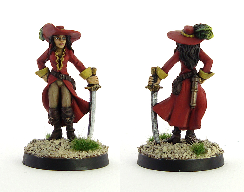
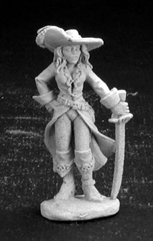
The model on the left is actually a scifi mini from the Cobalt-1 range currently owned by Bridge Miniatures, and I think I got her from Alex over at Leadballoony. I assume she’s some sort of alien: the model did not have heels at all and I sculpted them on with putty. For some reason, her face reminded me of a young Pam Grier, so I decided to paint the model with dark skin. The two other models are printed pieces from Iain Lovecraft’s Pirates vs. Cthulhu kickstarter. I should’ve printed the middle mini a little smaller, but couldn’t be bothered as the size won’t be noticed anyway. On the right we have an excellent miniature rendition of Anne Bonny as she’s depicted in Black Sails.

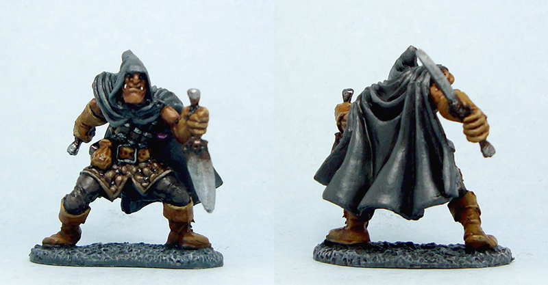
L to R: Black Scorpion x 2, Reaper

Here, the first two miniatures are from Black Scorpion, and I really like them! They’re very characterful, but in different ways, the first one with a murderous intent and the second being wonderfully flamboyant. Extra bonus points for a body shape sadly very, very, very uncommon in woman miniatures which very much tend to be of the “sixpack and breast implants” variety. It’s one of the nicest pieces I’ve seen in a while! The thid mini is from Reaper Miniatures, and a good example of how fantasy miniature ranges can provide some excellent minis for pirate gaming.

L to R: Dead Earth Games x 2, Vae Victis

The third batch of three consists of two minis from Dead Earth Games’ Pirates of the Dread Sea range, and a very pirate-like vampire hunter from Vae Victis. For the pirate carrying the multi-barreled nock gun I went for some tattoos which I’m fairly happy with! They make her look pretty bad ass. The mini with the hook hand had an Indian look about her, so I used a fairly bright orange for the dress. It made me realise it’s a colour that I almost never use, but I quite liked the end result.

All together now!

There are miniatures here from no fewer than six different manufacturers, and I think the group shot is a nice example of how a uniform painting and basing style can really bring different lines together. At this stage and especially combined with my existing pirate women, I have all the minis I need for my crew. However, I’m quite motivated to paint at least a few more! It’s bringing some much needed variety to my pirates: before these minis the gender balance was something like 38 men to 8 women. It’s not a big thing in the overall scheme of things, but nevertheless makes me happy. It might be worth noting that this crew is distinctly lacking in pirates of the pin-up variety. As some of those can be nice sculpts, there are some cases where I’ve painted bare legs as tight pants, which is a nice enough compromise to me.

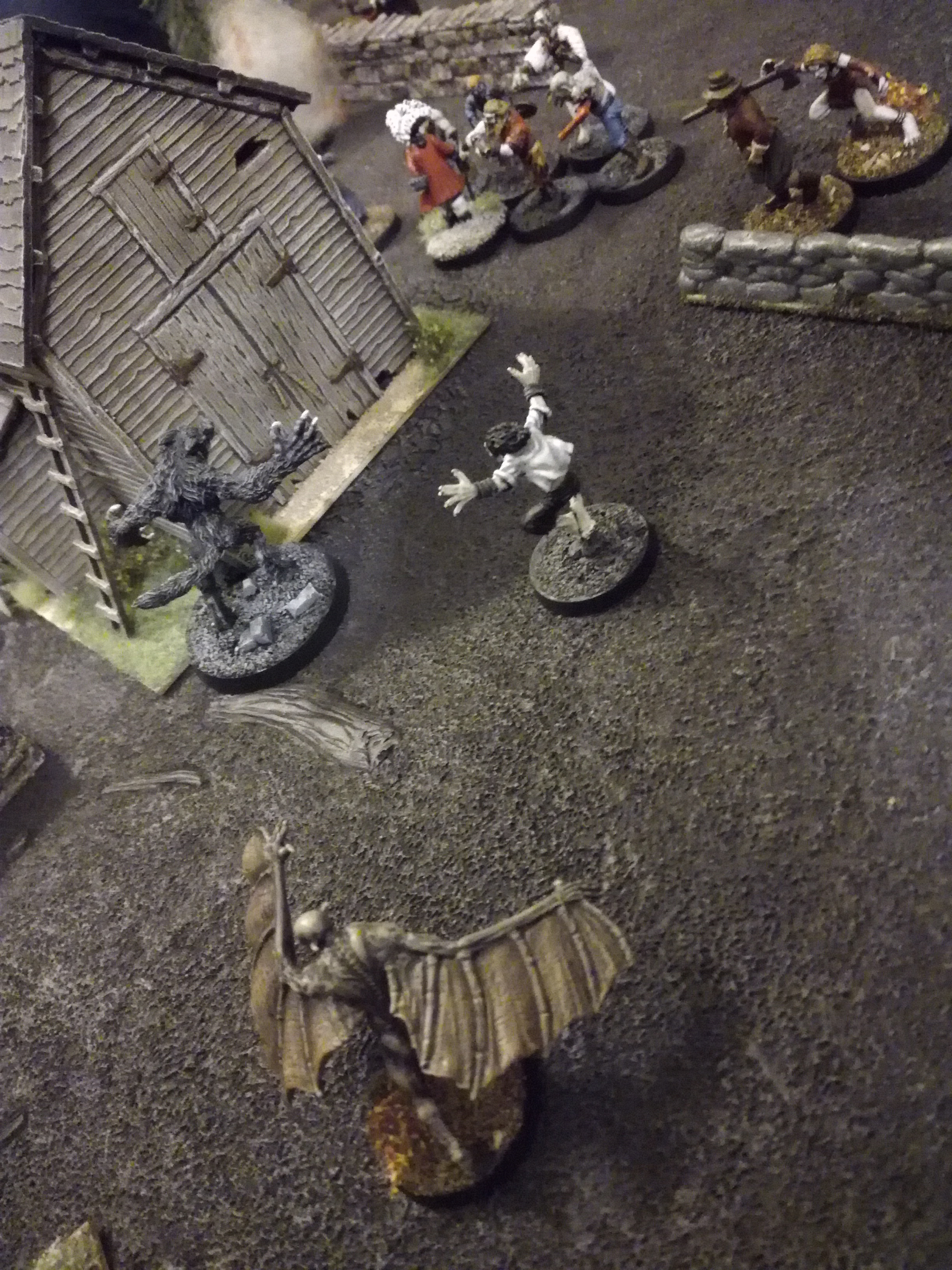
Work on the Ghost Archipelago project carries on, comments welcome as always!

h1

From the painting desk #68 – Another motley crew

December 23, 2019

Fighting the urge to present them as mötley crëw, here’s another batch of pirates – they never end, do they? This time it’s a mix of custom printed Heroforge pieces and miniatures I bought as physical objects. It’s funny how that has become a meaningful separation with the printer!

Click for a larger version

First up are the brothers Mulligan. They are Heroforge creations, as you can probably see. The thing I love about Heroforge (and I might have to make a separate post on this) is that you can create your own pieces and tell your own stories. In this case, we have the good brothers. While I’ve never given them first names, I imagine them as this Irish duo, a classic combination where one is a huge, burly brawler and the other a fast-talking gunslinger. To tie them together visually I painted both with pale skin and red hair, and I think it works pretty well.

Click for a larger version

Next we have the big swords. The woman on the left is another Heroforge piece, while the man is from Black Scorpion. While placing them side by side like this reveals the softer details of Heroforge pieces – especially compared to super crisp resin – I’m happy with both. Another thing in Heroforge’s favour is the control it gives you in customizing your minis. In this case I wanted a bit more diversity, so I wanted to create a female pirate who wasn’t whipcord-thin and abnormally busty. Instead I made a pirate that to my eye looks strong, with the heavy blade adding to the effect. I also gave her black African features.

Click for a larger version

The final pair of this post are a pirate lord from Reaper miniatures (sculpted by Bob Ridolfi) and a drunk pirate (sculpted by Evgenii Tkachenko) I found for free on Thingiverse. The pirate lord is especially lovely, a really characterful piece with his expensive clothing and flowing locks! I gave him a blue and yellow colour scheme, which made me instantly think of Sweden. Who knows, maybe he is a Swedish pirate lord. Painting Reaper miniatures always reminds me that I should paint more Reaper miniatures. The drunk pirate, despite the sculpt’s simplicity, manages to have character as well. There’s something about the pose that I really like, he looks very much like a henchman.

I’m usually not a huge fan of how my minis look in these portrait-style pictures, so I figured I might start setting them up in some more scenic shots in addition to the close-ups. So here you go, here’s the pirate lord addressing his motley crew. I think they look like a wonderfully interesting group. To me, this is what I want to achieve: tiny little narratives with colourful characters. I don’t really game with my minis, so these little stories are what makes stuff interesting for me.

Click for a larger version

As I’m writing this, my new printer – this time an FDM one for printing larger pieces – is on its way. Man oh man, this hobby never ceases to surprise me.

h1

Love and unicorns!

June 9, 2019

It’s not often that I manage to get my darling Emmi to paint miniatures, and it’s a crying shame because she’s really, really talented. However, it appears that when presented with the right miniature to paint, not too much coaxing is needed. Enter the unicorn!

Painted Reaper Bones unicorn

Click for a larger version

A Reaper Bones model, Silverhorn the unicorn (that rhymes) is nice and dynamic. Now, I hate, or at least dislike, painting horses. Too much flat surface and the blending is always rubbish and and and. Emmi, however, just went to town on this and before I had had time to manspl carefully inform her of the intricacies of miniature painting, she’d gone straight to wet blending (which I’ve never done), so yeah. It’s rare that I manage to get such smooth blends on my models, but of course this is her third model already.

The model actually sat almost finished for a year or so, and she finally got around to finishing the base with some Mininatur white blossoms. I think it looks awesome.

Anyway, she said she’s happy to paint more minis as long as I tell everyone how great she is, and I’m happy to oblige. She is.

h1

From the painting desk #61 – Terrors that flap in the night

November 18, 2018

It’s more than a couple of weeks since Halloween, so time to recap! As is tradition, I put on a horror themed miniature game for my friends, which in turn was a good incentive for me to get some vampires painted.

Click for a larger version

These two ladies are part of Bad Squiddo’s My Last Sunrise line, and they’re lovely! I showcased the third one in a previous post. Long, flowing robes and clean sculpting (courtesy of Gus Kearns) made these really fun to paint. Again, I went with a very grey skintone – I had both corpses and statues in mind. I painted the robes in bright colours to counterbalance the grey skin. The painting isn’t as smooth as I’d like – it was a bit rushed so the blending is just not there especially on the blue dress. Other than that, they’re ok.

Click for a larger version

Another miniature from said Kickstarter campaign, this one needs no introduction. He’s obviously the big D, Dr. Acula, Alucard, the mysterious owner of Carfax Abbey…so yeah Dracula. A quality sculpt by Gary Morley and a easy to paint mini, I’m quite happy. As with the notorious cloaker, I went with a very, very classic look with red cape linings and all. I went for a more human – if pale – skin than with the brides, to represent Dracula being a bit more sophisticated and trying to blend in with humans.

Click for a larger version

This one is from Reaper, and documentation in this blog reveals that I bought the mini…nine years ago, back in 2009. Sheesh. Well, after nine years of waiting, she’s now finally painted! As you may have noticed, I love painting red, so I went with that here as well. It was a quick, rough-ish paintjob but I feel it does the trick. After all those years in the cupboard I’m just happy that the mini is finished. It’s still a pretty neat sculpt, so kudos to Derek Schubert!

Click for a larger version

Vampires come in all flavours, and this one from Heresy is definitely one of the nastier-looking ones. Paul Muller has managed to sculpt one of the nicest vampires around, in my opinion. I gave the mini a really quick paintjob consisting mostly of drybrushing and washes, but I’m still immensely happy with the end result. It looks like a nasty beast, just like I wanted it to.

The Halloween game itself was great fun as usual, with vampires successfully eating every single villager before sunrise. A random selection of photos shows you many of the usual suspects appearing in these Halloween games as well as some of the painted minis showcased above. You can click on any photo to open a bigger version in a new tab. Thanks to the players for the photos!

The hunters…

…and the hunted

Nosferatu stalks his prey

A hapless nightwatchman flees from approaching zombies

A damsel in distress

It’s a monster rampage!

Due to some really poor luck on the vampire’s part, these two basically spent such a long time together that they became a couple


h1

From the painting desk #56 – Dragon

September 9, 2017

There comes a time, when we heed a certain call

and we finally pick up that dragon that we bought when we were 20 or so.

This awesome dragon has been sitting in my cupboard for years and years and years and years. I originally bought it way back when I was designing my own Reign of Fire inspired skirmish game of dragons vs. humans. As the movie was released in 2002, I assume that’s pretty much when the dragon was bought – meaning it has sat unpainted for 15 years. That’s the time it takes for a newborn baby to grow up and go through the Finnish public education system, or for a 20 year old, fresh out of high school geek living with their parents to become a 35 year old dissertation writing geek. Time flies, doesn’t it?

This was the result of yet another Random Platypus painting challenge, this time titled Old and mouldy. It was intended for people to finish pieces that have been mouldering away, so this was a perfect pick. It is a Reaper Miniatures dragon sculpted by Sandra Garrity, and should you want one, it’s still in production. I loved it back then, I love it now. The pose is dynamic and very dragon-y and makes the creature very imposing.

I don’t paint dragons very often, so I wanted to have fun with this one. I wanted to capture the feel of the old red box Dungeons & Dragons cover art by Larry Elmore, with the red dragon leaning over its piles of gold. I’m sure you’ve seen it.

I had originally based him on a 40mm square base, which was pitifully small. I had also propped him up with a piece of wire. Those had to go, as I wanted a more impressive base. A I was documenting the process for the forum painting challenge, here is a before-and-after photo.

Click for a larger version

The new base was a car mount for a cell phone holder – you can still make out the Nokia text in the centre. I had kept it lying around for ages, as you tend to do with stuff like this, in case it’s ever useful. The original store photos show the dragon leaning back on its tail, which I didn’t like. That’s probably why I propped it up with the wire originally. As I wanted to get rid of the wire, I had to gently bend the dragon forward to bring the balance up a bit. Once I’d done this, I pinned it to the base and secured it with ProCreate putty (not shown in the photo).

Painting the dragon was a fairly straightforward process. I knew that my patience for such a large piece would be limited, so I just washed and drybrushed away for the most part. I did do some layering on the belly, claws and teeth, but this was definitely not very delicate painting. The sculpt however is very forgiving, and I’m very pleased with the look.

Click for a larger version

Click for a larger version

Obviously the dragon needed treasure. I built small mounds out of ProCreate to represent piles of treasure, and sculpted in a bit of stonework to depict a dungeon floor. The treasure is painted ballast with some decorative jewel beads and painted over with cheap glitter nail polish – I definitely recommend both if you’re ever making miniature treasure stuff!

Click for a larger version

There you have it! A dragon to look nice in my glass cabinet and hopefully to terrorize adventurers in years to come. It would only be fitting for him to actually make it to a game of Dungeons & Dragons, so dear GM, if you’re reading this…

Things have been quiet on the blog front lately, as I’m doing some home renovation stuff and that’s taking up a big part of my time. I’ve still been plodding away at miniatures stuff, so hopefully I can show some of those soon.

h1

From the painting desk #44 – Horrors of the deep

October 23, 2016

Last year’s Halloween game was a success, so I’m running another one this year. With my interest going the way of pirates in the Caribbean, this year’s event will be themed accordingly. A few newly painted minis have joined my roster for the game:

Click for a larger version

Click for a larger version

This crab man is one of the post-apocalyptic mutants from Ramshackle Games. A somewhat crude but characterful sculpt, his crustacean appearance makes him a perfectly themed old school Hollywood sea monster. The model was fun to paint, the different ridges and textures making him perfect for drybrushing. I drew some inspiration from real life crabs for the pincers, really making them stand out from pale orange/yellow body.

Click for a larger version

Click for a larger version

The second model is a Reaper Bones spirit. As it was a nice, translucent green plastic, I didn’t do a lot of painting on it apart from a very light white drybrush. After some consideration I painted in blue glowing eyes (which don’t look as horrible as in the photo), but left it at that. I mean, if you’ve got a special effect with the material, why paint over it too much? Instead, I devoted some extra attention to the base.

I’ve themed both bases in the “dark, unearthly ocean floor of death” style I used earlier on my undead pirate now permanently named Armitage Shanks. I added an old Warhammer tobstone and some broken planks to the spirit’s base to suggest a shipwrecked sailor.

These were a fun diversion, and will be going on the table in less than a week! Comments welcome as always.

h1

From the painting desk #40 – Pirate queen

May 28, 2016

I’m back from five weeks of travel (more on that in a later post), and it’s time to get this show on the road again. What better way to do it than by showing off a new, painted miniature?

Click for a larger version

Click for a larger version

The miniature in question is Melisande Wavecutter, a female pirate by Reaper Miniatures. Lovely mini and great fun to paint! She’ll be leading one of my pirate crews, and I’ve dubbed her “the pirate queen” in my head. Her relaxed but no-nonsense pose makes her a wonderful leader figure. I also like the fact that she’s not sporting the “breasts out, bikini bottoms and thigh-high boots” common to most female pirate miniatures. That’s why I tend to browse through Bad Squiddo Games’ Believable female miniatures collection if I’m on the lookout for a smartly dressed female mini.

I went for a Spanish look, with dark hair and a skintone that was a touch darker than the one I normally use. I stuck to strong colours, but a fairly simple paintjob. This was my first time using a wet palette, and as I hadn’t been painting lately, I decided to devote some more attention to blending than normal. I hope it shows in the end result, at least I’m happy with it myself! The glaring mould line in the hat is luckily a trick of the light and not really as visible as in the photo. I don’t usually paint facial detail apart from the occasional beard stubble, but here I tried adding a touch of colour to the lips to make the character that extra bit more feminine.

It’s really fun to be back to blogging and painting, so expect to see a lot more in the future, including the usual Salute shopping report.

h1

Shabby chic

February 22, 2016

Another finished Warbases building, one of their range of modular, simple pieces. Now, when I say simple, I really do mean simple. The basic modular building is a featureless box with a slanted roof. Of course, this makes it perfect to modify, which is why I bought quite a few. I originally intended to make a Spanish Caribbean style town which is why I bought the original few. My vision changed, but I still wanted to use the buildings of course.

After the stable, I wanted to build something a bit more fancy, yet in the same run-down style. That’s where the in-game story for the building started. I’ve found that much the same as with miniatures, providing a mental backstory to a building helps me make it more interesting and detailed. As the whole idea of my town is that it’s a British trading outpost that has slowly slid under pirate control, I figured that there would be some fancier buildings for the officials and other upper crust types. This building was maybe once owned by the local magistrate or a rich trader. After being taken over, it has slipped into decay a bit, but is still impressive.

Click for a larger version

Click for a larger version

Click for a larger version

Click for a larger version

I wanted the building to look both shabby and impressive at the same time, so while I made it plastered (to set it apart from most of the other buildings that will have wooden exteriors) I made sure to make the plaster cracked and the nice blue paint faded and dirty. I added a balcony from Warbases and put in some extra decoration using coffee stirrers, and made supporting and decorative columns from barbecue skewers. The balcony and the window frames and shutters were all painted white, but heavily weathered in keeping with the run-down look. I also added a small patio from squares of card, but made sure that stones were missing and some misaligned. The roofing was done using the laser-cut sheets available from Warbases.

While I wanted the building to look worn, it needed to show that whoever was inhabiting the place still appreciated it. The next few steps also came from necessity.

First up were the windows. While I’ve now bought windows with smaller panes, the original ones were great, big, abyssal black holes in the walls and didn’t look right. I solved this by painting in some curtains. It makes the house look more lived-in, plus provided an extra touch of colour.

Click for a larger version

Click for a larger version

Click for a larger version

Click for a larger version

Next were the balcony detailings. I had done the coffee stirrer bits quite quickly, resulting in pretty rough gaps at the balcony corners. This was easily remedied by putting in some nice flowers flowing down over the gaps. They also made the balcony look much more lavish. In order not to make it look too fine, I used small plastic barrels by Renedra (procured through Bad Squiddo Games) as flower pots.

Click for a larger version

Click for a larger version

As a final touch I added some details around the place. The bales of cotton and other goods (by Ainsty and Renedra) in front of the building are intended to be a non-subtle show of wealth, while various patches of grass and the vines creeping up the wall just add a bit of colour.

Click for a larger version

Click for a larger version

Click for a larger version

Click for a larger version

I’ve already got a suitable tenant for the building, a female pirate by Reaper Miniatures that I also picked up from Bad Squiddo. I’ve already dubbed her “pirate queen” in my head, so this should be a nice, shabby palace for her!

Photo © Reaper Miniatures

Photo © Reaper Miniatures

This piece took plenty of work, so I’m happy to say I’m satisfied with the result. Comments welcome as always!

h1

From the painting desk #31 – Cutthroats

May 4, 2015

A couple of newly painted miniatures, both nicely fitting under the “cutthroat” definition. They bring this year’s painted miniatures count to 10.

The first one is a pirate by Foundry.

Click for a larger version

Click for a larger version


A lovely, characterful mini that (unsurprisingly for Foundry) suffered from poor casting. The barrel of his gun was so misaligned that I replaced it with a plastic one from a GW set. I didn’t bother to smooth the join over with putty, but I think it looks decent. This pirate heralds one of my two new projects inspired by Salute, so expect plenty more pirates in the future. It’s really fun to paint these bright colours!

The second mini here is a half-orc assassin type from Reaper’s Bones II set. We bought the entire set for our regular RPG crew, and spent yesterday painting models for our upcoming characters.

Click for a larger version

Click for a larger version

Anyone who knows me (or has read this blog a bit) should know that I hate cleaning up models. The Bones material is quite nice, but can be insanely awful to clean up as you can’t really scrape it. As we were making minis less for viewing and more to be used as playing pieces, I simply left some sections uncleaned. Yes, it looks awful yet it doesn’t look to bad at the same time – the worst parts are luckily hidden by the photo angle. This was a familiar palette with browns and greys, and I think he turned out very decent. We had a great time painting, and I’ll be sure to share the rest of the minis once they’re finished.

I can’t tell you how happy I am to be painting again. Feels like coming home after a while.


h1

It’s ruined!

July 21, 2014

I’m getting back to painting after one of my hobby-uninspired periods (see this blog post from four years ago). Sort of like exercise, you have to ease yourself into it after a break, so I figured I’d start easy and built a few ruins for my Pacific Rim project. After all, those cities are going to be hit and wrecked, so I’ll need plenty of replacement pieces for destroyed buildings.

After buying a bunch of Monsterpocalypse buildings and popping them off their bases, I was left with plenty of empty plastic bases which I didn’t feel like throwing away. These provided a great base for ruins. I then simply slapped on rubbish – mainly plasticard cut-offs, sprue pieces, sand and small rocks, undercoated with black and gave the whole thing a quick drybrush treatment. They turned out quite nice, and I wasn’t going for beautiful diorama pieces anyway as they’re rather just glorified tokens.

Click for a larger version

Click for a larger version

The pieces work nicely on the battlefield. Here’s a shot of the kaiju Knifehead with one of the ruins. I like the way the base fits in!

Click for a larger version

Click for a larger version

As and added bonus you can combine them and they work well with 28mm too, which is always a good thing:

Click for a larger version

Click for a larger version

Setting up the mini diorama above prompted me to throw together some ruins, Knifehead and some of my city terrain and smoke pieces to show you what it’s meant to look like eventually:

Click for a larger version

Click for a larger version

As always, all comments welcome!

%d bloggers like this: