Posts Tagged ‘Foundry’

h1

Here, piggy piggy!

March 14, 2016

Pirates ought to be somewhat dirty. The actual, historical pirates were a rowdy, often heavily drinking bunch, and this has of course been carried into popular culture as well. There’s a fun scene in the first Pirates of the Caribbean movie, where captain Jack Sparrow wakes up his trusted first mate Gibbs, who’s dead drunk in a pigsty:

gibbs

The scene fit my ideas of my own 28mm pirate town perfectly, and I wanted to build a little set piece of a drunk pirate passed out amongst pigs. I did some quick online shopping, buying some pirate casualties from Foundry and some pigs and assorted items made by Ristul’s Extraordinary Market. Both the pigs and the pirates are characterful sculpts, and I love the various accessories, the trough filled with slops especially.

I had a fairly large plasticard offcut that I used as a base. I simply slapped on acrylic caulking, stippled it with an old sponge and stuck the miniatures on, resulting in this:

Click for a larger version

Click for a larger version

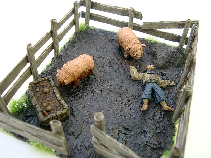
After that it was just dirty, dirty painting. I really went to town with washes – after all this was supposed to be someone who has stumbled into a pig pen dead drunk and then passed out. I even painted some vomit on his chin and chest to make him a bit more disgusting. I let the brown wash (GW Agrax Earthshade) pool up in various areas to make the mud look more…muddy.

With the miniatures painted, I built the fences from bbq skewers and coffee stirrers using this very handy tutorial:

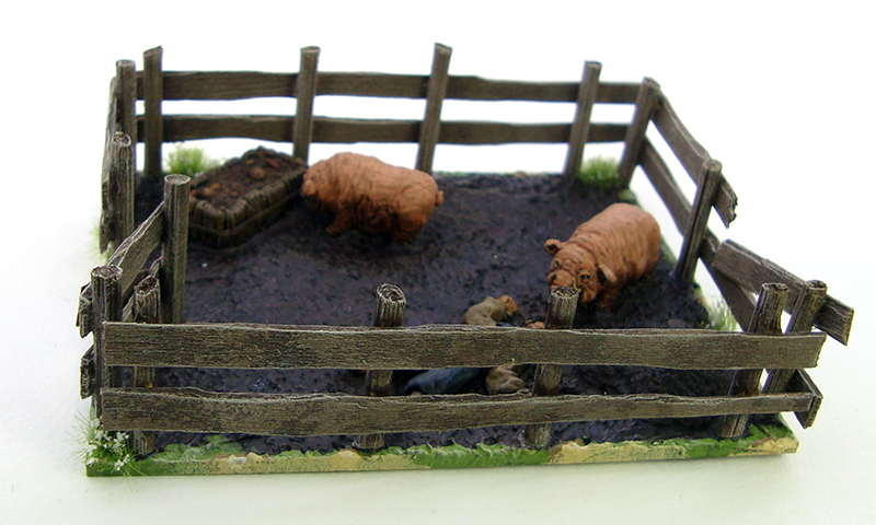
The idea of whittling down the coffee stirrers for a more irregular look is so simple that I feel really dumb for not thinking of it. It makes for a very nice looking ramshackle fence. I made sure to make the fence uneven and rickety. I painted the fences before sticking them on, painted the edges of the base to match my gaming board and as a final touch I added some flowery grass tufts around the pen for a more natural look. Here are pictures of the finished piece:

Click for a larger version

Click for a larger version

Click for a larger version

Click for a larger version

Click for a larger version

Click for a larger version

Click for a larger version

Click for a larger version

Click for a larger version

Click for a larger version

Click for a larger version

Click for a larger version

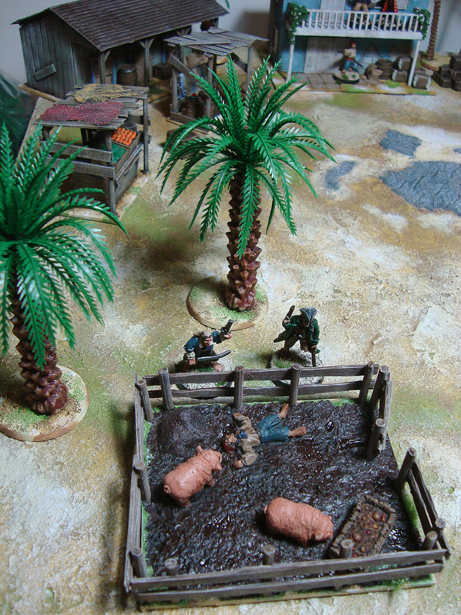
And here’s a shot of the pig pen in (simulated) action, as two pirates check in on Philip the Frenchie after yet another of his nights of rum-fueled shenanigans:

Click for a larger version

With the pig pen finished, I think I need to paint up pig farmer Brick Top as a homage to one of my favourite movie performances ever, Alan Ford in Snatch. The fellow will fit right in with other scoundrels.

All of a sudden, those pigs are looking a lot more sinister…

Feedback welcome and appreciated as always!

h1

From the painting desk #39 – A pirate in a hurry

February 28, 2016

It’s almost March and I’ve only just painted my first miniature of the year. Ok, in my defense I’ve mainly worked on terrain, but still…

Anyway, here’s a running pirate! He’s another Foundry one, and like all the others, a nice and characterful sculpt. For his shirt I went for the colourful-but-grimy look, which came out decently enough.

pirate3

Click for a larger version

I had to fix the hand holding the sword a bit – either I’m completely misreading the miniature, or there’s some very lazy sculpting there. The hand didn’t really seem to be holding anything, the grip of the hilt was just sort of on top of the hand. I added a lump of ProCreate putty to make it look more natural.

With my impeccable sense of humour, I also present the obvious reason for the pirate’s running state. It also conveniently allows me to show the outhouse by Ainsty that I recently painted up. The outhouse was a fun little diversion, as it was very quick to paint and is a nice piece of scatter terrain. The good thing about painting this kind of model is that it’s supposed to look ramshackle, so you can just flail away with the paint and it still looks suitable. So here it is in all its glory, ready for some cagafuego.

Click for a larger version

Click for a larger version

So, first model of the year, but the project is moving along nicely. Comments…ah, you know it already.

h1

From the painting desk #35 – Flamboyant George

October 4, 2015

Reinforcing my pirates is a colourful individual I named Flamboyant George. He’s loosely inspired by Robert de Niro in the movie Stardust (and this scene especially). After the previous pirate’s toned-down palette, I wanted to paint something with a bit more colour, and found the idea of a pirate with a penchant for matching accessories delightful. He’s prepared to mercilessly cut down anyone for their hat or boots. The miniature is from Foundry.

Click for a larger version

Click for a larger version

The mini was also a chance to use purple, which I rarely do for some reason. I painted his hat, belt and boots as matching and threw in red details in the form of the band around his hat, the eyepatch and his socks. The yellow scarf works well with the purple shirt in my opinion – unsurprising as they are opposite colours. I like how the overall colours turned out and how the pirate still manages to look fairly menacing. While the concept stems mostly from just me wanting to have some fun, it’s not without historical merit, as pirates sometimes used the fancy clothes and the like that they stole or bought.

Flamboyant George is this year’s 20th painted miniature.

h1

18th century comparison

July 17, 2015

I love miniature size comparisons. With plenty of manufacturers out there, it’s useful to know which manufacturers fit together size and style wise. I’m not too fussy with what lines I use together (as you can see from my Colonial Marines), but I know a lot of people are very particular about it. As I’ve amassed a lot of pirate/18th century miniatures in 28-ish mm recently for my small project, I figured I’d do a quick comparison for the benefit of everyone out there. Posts like this are something I tend to google a lot, so this is just paying it forward. This isn’t a review as such, more a quick comparison.

The ranges compared are 18th century sailors by Galloping Major, pirates by Black Scorpion and Foundry and FIW civilians by Redoubt. Here they are side to side:

Click for a larger version

L to R: Black Scorpion, Galloping Major, Foundry, Redoubt

In my opinion all these can be used together, but as said above, I’m not fussy. If you want matches, here are my suggestions:

Black Scorpion has a different style from the others. They also have a fairly large range, so you could just use them exclusively. If the height difference is the thing bothering you, Galloping Major matches up nicely. Style wise Redoubt’s weapons are thinner than Foundry’s or Galloping Major’s and match up quite well with Black Scorpion.

Redoubt can easily be mixed with both Galloping Major and Foundry.

Galloping Major matches Black Scorpion in height but not style. They’re a good match with Redoubt and Foundry style wise, but in general chunkier and taller. However, you could circumvent the height difference by removing the integral base from the Galloping Major minis.

Foundry are short, but style wise match Redoubt and Galloping Major. You could remedy this by giving them a boost under their integral base using putty or a washer.

So that’s my take! As a disclaimer, note that these are single samples from larger ranges which in themselves have internal variation and and..oh heck, I’ll just leave it to Captain Barbossa:

As I like all of these minis and don’t want to unnecessarily put you off from buying them, shown below is a picture of two Foundry pirates and a Black Scorpion one. As you can see, you can do wonders with matching basing and I think they go together just great, even with the height difference.

Click for a larger version

Click for a larger version

Hope this post proves useful! If it does, I’d love to hear about it.

h1

Unleash the Cagafuego!

July 4, 2015

In my previous post I lamented too small cannon, so I wanted something bigger. Remembering I had just the thing in my bits box, I got to work. Said “thing” is a WHFB cannon from the 6th edition boxed set, now 15 years old. It’s not in the best shape, having had bits glued, removed, re-glued and so on, as well as fairly haphazard filing and smoothing of mould lines and such.

Courtesy of me 15 years ago

Courtesy of me 15 years ago

The cannon itself is a big, ornamental beast as fits the gothic fantasy look of WHFB. This led me to thinking that obviously such an ornamental piece on a pirate ship must be looted from the Spanish. Seriously, is there another explanation? I think not. This also gave me the chance of using one of my favourite words ever, as I named it…

Cagafuego!

Impressive name, isn’t it? Of course, it has a historical background, as it was the nickname of a Spanish ship captured by Sir Francis Drake. As Wikipedia will tell you:

Nuestra Señora de la Concepción (Spanish: “Our Lady of the (Immaculate) Conception”) was a 120-ton Spanish galleon that sailed the Peru – Panama trading route during the 16th century. This ship has earned a place in maritime history not only by virtue of being Sir Francis Drake’s most famous prize, but also because of her colourful nickname, Cagafuego (“fireshitter”).

Seriously, is there a better name for a massive Spanish cannon than “Fireshitter”? I think not. It appeals both to my love of history and 10 year old’s sense of humour.

Cagafuego is a huge piece, and I’m thinking that its role on the ship is that it’s a piece mainly for intimidation. Due to the build of the ship and for practical reasons, it’s only going to carry some seven cannon altogether – much fewer than a ship of this size historically would have. Of these seven, six will be normal sized and Cagafuego much larger, so I’m thinking that it’s always a bit of a spectacle when it’s utilised. You know:

– Captain, they’re not striking their colours.

– Very well then. ROLL OUT CAGAFUEGO!

The only problem was that I didn’t have a carriage for the gun as the original mount was a field one, not suitable for ships. Having grown more accustomed to working with plasticard and coffee stirrers, I figured I’d try my hand at building the carriage from scratch, resulting in this:

Click for a larger version

Click for a larger version

Click for a larger version

Click for a larger version

It turned out alright, I think! Sure, anyone into things like history and realism will probably find plenty of things wrong with it, and there are some irregularities here and there, but to my fantasy pirate eye it looks as it should. The core structure is plasticard with an old Warmaster base underneath. The wooden bits are coffee stirrers, the wheels are cut from 10mm diameter dowel rod and the axles are decorative studs meant for clothing.  The smaller iron rings are plastic pieces from the original cannon set and the bigger ones are from WHFB orc weapons. As with a lot of my woodwork, this one also relies a lot on the “it’ll look nicer once painted” factor, but I have high hopes!

To cap off the post, here’s a comparison shot of Cagafuego and my existing Ainsty cannon as well as a Foundry pirate. Neat, right?

Click for a larger version

Click for a larger version

h1

From the painting desk #33 – Another pirate

May 26, 2015

As you’ve no doubt noticed, I’m painting pirates. Here’s another one from Foundry, my 12th painted model of the year.

Click for a larger version

Click for a larger version

It’s funny that I said in the previous post that the pirate project is letting me use all my bright colours, as this one mostly had fairly muted colours. I couldn’t help it, as he just looked like a shabby individual even unpainted. I did give him a purple scarf though, so at least some extra colour was added. One thing I’m liking a lot in this project is that a pirate crew is a perfect chance to throw together a group of models without regard for uniformity. In my opinion the muted palette works on this model, and he’s a fine addition to my crew.  Feedback welcome as always!

h1

Pirate madness

May 7, 2015

Salute 2015 sparked a huge interest in pirates in me. I was thinking of keeping it very low key – you know, a few packs of miniatures from Black Scorpion and Foundry, some pieces of special terrain, nothing major.

As these things tend to develop, yesterday evening I found myself in possession of a huge, 80 cm long pirate ship. It’s the Black Pearl from the Pirates of the Caribbean movies, it comes from this playset and I got it for 30 EUR off a Finnish auction site. As I said and the pictures show, it’s a massive model, and I’ve no idea how I’m going to store it, but for now I won’t worry about it. Instead I’ll focus on the positive!

There’s so much to love about the ship from a miniature gaming point of view. It’s magnificently scaled for 28mm, it’s nicely textured and has easy access to the ship’s interior. On top of that there are great toy functions such as a small soundboard and even flashing red led lights for the cannon. A piece of the ship’s prow also comes off, which will be a good way to show damage or to depict a beached ship.

The ship will give me plenty of work. While the scale is good for the most part, it’s still intended for large action figures, so I’ll need to make doorways smaller, give the ship a smaller rudder, replace the cannon and so on. Some of the less detailed pieces will need a going over with coffee stirrers and some toy mechanisms will need to be removed. I don’t doubt that it will be a major task, but I’m still looking forward to it! To make my task easier, I’m going for a functional gaming piece and as said, I’m trying to keep many of the toy functions intact. This means I won’t go over the model, puttying over and sculpting every join and gap, nor will I add authentic rigging or anything like that. I know myself, and I want to actually finish this one!

I’ll post updates on the blog as the thing progresses. While I don’t usually show a lot of work in progress stuff, I think that sharing in this case will be good for keeping up the morale (and the stamina). Hopefully this will also provide you with inspiration and entertainment! It goes without saying that feedback, ideas and experiences are warmly welcomed.

I added some quick pics below just to give you an idea of the whole, sorry for the rubbish lighting and setup! All the minis are 28mm.

The ship in all its glory

The ship in all its glory

The rudder has been removed and the railing will be cut down

The rudder has been removed and the railing will be cut down

The crow's nest is large enough for several minis

The crow’s nest is large enough for several minis

Plenty of deck space, the discs will be removed

Plenty of deck space, the discs will be removed


h1

From the painting desk #31 – Cutthroats

May 4, 2015

A couple of newly painted miniatures, both nicely fitting under the “cutthroat” definition. They bring this year’s painted miniatures count to 10.

The first one is a pirate by Foundry.

Click for a larger version

Click for a larger version


A lovely, characterful mini that (unsurprisingly for Foundry) suffered from poor casting. The barrel of his gun was so misaligned that I replaced it with a plastic one from a GW set. I didn’t bother to smooth the join over with putty, but I think it looks decent. This pirate heralds one of my two new projects inspired by Salute, so expect plenty more pirates in the future. It’s really fun to paint these bright colours!

The second mini here is a half-orc assassin type from Reaper’s Bones II set. We bought the entire set for our regular RPG crew, and spent yesterday painting models for our upcoming characters.

Click for a larger version

Click for a larger version

Anyone who knows me (or has read this blog a bit) should know that I hate cleaning up models. The Bones material is quite nice, but can be insanely awful to clean up as you can’t really scrape it. As we were making minis less for viewing and more to be used as playing pieces, I simply left some sections uncleaned. Yes, it looks awful yet it doesn’t look to bad at the same time – the worst parts are luckily hidden by the photo angle. This was a familiar palette with browns and greys, and I think he turned out very decent. We had a great time painting, and I’ll be sure to share the rest of the minis once they’re finished.

I can’t tell you how happy I am to be painting again. Feels like coming home after a while.


h1

From the painting desk #21 – More Utopia

April 14, 2013

Wow, this is actually my 250th post. While the blog hasn’t been updated as frequently as before, I ensure you it’s still going strong. As the blog now has a quarter of a thousand posts, I figured I’d give you a look at what’s up.

As you can’t have failed to notice, I’ve been running a near future military scifi campaign for a while now. With seven games played (AAR #7 coming soon!) this is the longest campaign I’ve run in good long while, and both I and the players have really enjoyed it. You can find the associated posts by checking out everything tagged Utopia. The campaign has not only allowed me to use a lot of my miniatures, but also has really inspired me to paint minis and build terrain a lot. Deadlines help too!

Click for a larger version

Click for a larger version

Anyway, it’s on with the minis in chronological order. First up is a hunting beast for my Predators. The miniature is actually a hellhound by Heresy with the choice of a skeletal head. I really liked the idea of Predators using dog-like hunting creatures as shown in the Predators film. This one’s by no means a full match, but I think it looks fearsome and alien enough. Like practically all of the Heresy multipart minis, I had plenty of work getting the hound to a paintable state. There were some heavy mould lines and the fit of the parts really wasn’t stellar. After I’d all but finished painting it, I found out to my delight that I’d missed a glaring mould line on the hound’s side. As I didn’t want to ruin the paintjob, I painted some scarring over it, which I think turned out nice.

Click for a larger version

Click for a larger version

Next up is a conversion. While originally painted for Utopia, this fellow hasn’t appeared on the field so far. It’s actually the late-ish Pvt. Jane, who was captured fighting the Terminators. As you can see, he has been subjected to horrible experimentation and has been made into a cyborg. The model is a warbot from Pig Iron Productions with a head from Puppetswar and a minigun from Maxmini. I think the parts work nicely together and combine well to make a really intimidating figure. The paintjob is super simple, with basically just washes and drybrushing on the bulk. I paid more attention to the face, and I think it turned out looking pretty good. That resin head is pretty awesome, and I basically made this conversion just so I could justify buying the head…

L to R: Trill, Cohl, Abdul, Dastevan. Click for a larger version

L to R: Trill, Cohl, Abdul, Dastevan. Click for a larger version

Up next is a bunch of Utopia troopers – Trill, Cohl, Abdul and Dastevan. Nothing too special here, they were all given my typical trooper treatment. Trill is a Hasslefree mini, Cohl is a SWAT sniper from Foundry and Abdul and Dastevan are both from em4. I think Cohl is a good example of how a paint job can really change the way a model looks.

Click for a larger version

Click for a larger version

Topping off the post is General Hyun – set to appear in the upcoming Utopia AAR #7. Hyun is a Copplestone Castings miniature and I’m really really happy with him. Somehow those greys just turned out lovely and the uniform looks very crisp. I rarely get the feeling that I really nailed a mini, but with this one I’m patting my own back. Please refrain from posting ego-crushing comments!

h1

Werewolves by West Wind – a review

February 20, 2010

My review of the Reaper werewolves is one of the most read articles on Dawn of the Lead, which would suggest that there is an interest in werewolf miniatures. Another thing leading me down that track is the fact that I have a bunch. It’s time to put three of those under the looking glass and see what some of West Wind Productions’ lycanthropes are all about. Two of them are from West Wind’s Secrets of the Third Reich WWW2 (Weird World War 2) line. The line includes all sorts of fun things, with nazi zombies, vampires and the like adding to the chaos of war. The line has several werewolves, and I bought a few for use in my Underworld miniature project. The third one comes from West Wind’s Gothic Horror range.

All sculpts were very nice, and almost completely devoid of flash or mould lining. Big thumbs up to West Wind for this, since cleaning up bad casts is one of the aspects of this hobby that I hate.

Jager Werewolf “Wolfgang” looks vicious. His head is tilted up and his teeth are bared. His posture suggests that he’s either going through a painful transformation or simply howling at the sky in fury. His pants are torn and his whole upper body is bare. I really like this model except for one thing – and this holds true for all the WW werewolves reviewed here. The model has lost one finger and two toes in the transformation process. While I’ve no qualms about the shapeshifting altering the number of digits, the three-toed feet look birdlike. Combined with an almost scaly texture, Wolfie and his buddies look like they’re walking around on chicken feet. Other than this, he’s a wonderful wolfman. Wolfgang comes with a round 25mm slottabase, and is sculpted by Andy Cooper.

Wolfgang

Click for a larger view

Jager Werewolf “Mondheulen” translates smoothly as Moonhowler. Whereas Wolfgang looks very much like a wolf, Mondheulen looks like a werewolf in mid-transformation. His face/snout is almost rat- or bat-like, a little bit like this fellow or his friend. His proportions are weirdish, with an improbably slender waist and long limbs.  These don’t really bother me at all, but simply add to his menacing presence instead. Mondheulen looks very bestial and bloodthirsty, and his pose suggests he’s charging after some unfortunate victim. Like Wolfgang, Mondheulen has torn pants and chicken feet. Doesn’t mean I don’t love him, bless his little heart. Sculpting and basing as above.

Mondheulen

Click for a larger view

As the comparison pic below shows, the two werewolves are slightly larger than your average 28mm humans, making them just a bit more intimidating.

Jager size comparison

From left to right: Foundry, West Wind, Hasslefree, West Wind

Loup Garou (Great Werewolf) is a solid chunk of metal. He’s as big as the Reaper ones and even bulkier, a big beast. He’s a multi part casting, with the arms and the head being separate components. The parts fit well enough, but you’ll have to fill in gaps with greenstuff if you want a smooth finish. The werewolf itself looks pretty nice – again apart from the notorious feet (how hard could it have been to google some info on the subject?) He’s reaching forward with his left arm and his face is locked in a ferocious snarl. In my opinion it’s not quite as good a model as the Reaper ones, but comes close enough to be lovely nonetheless. The Loup Garou comes on a fairly thin integral metal base, and I unfortunately have no idea about the sculptor. If some reader knows this, do drop a comment. (Note: Thanks to reader Joel, I found out that this one – and apparently all of West Wind’s stuff  – is also by Andy Cooper. Thanks!)

Loup Garou

Click for a larger view

Loup Garou size comparison

From left to right: Foundry, West Wind, Hasslefree, Reaper

All the models are available through the West Wind Productions online store. The Loup Garou retails at £5.00 and the Jager werewolves at £4.00 each. This isn’t that bad a price for quality models, so I had no qualms about paying, even if £13.00 for three models sounds a bit steep.

Overall verdict: The West Wind werewolves are well worth buying. While they’re not quite as good as Reaper’s offerings, and if the chicken feet don’t put you off, you have some nice wolfmen in dynamic poses, and that’s always a good thing, isn’t it? Also, the Loup Garou is large enough to become a centrepiece model, if you put some time and effort in his painting and basing. All in all, these are a fine offering and well worth adding to your collection.

%d bloggers like this: