
From the painting desk #67 – A piratical assortment
October 12, 2019While I’ve been printing a lot more than painting recently, I’ve still managed to complete some pieces! I’m definitely seeing a risk here, though – printing is fun in itself, but it’s also adding stuff to the painting pile something fierce.
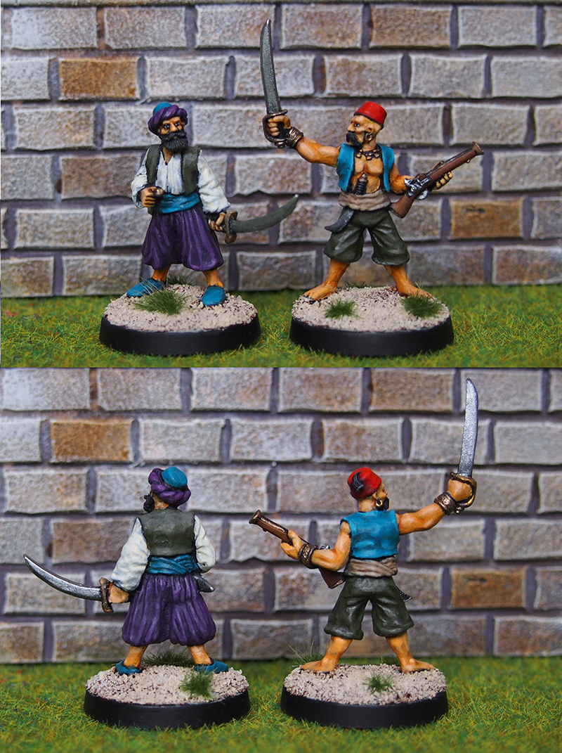
I recently read a book on Barbary pirates. Or rather, make that two books (both are very interesting, and well worth your time by the way). While I’ve thus far been mostly interested in pirates of the Caribbean variety, I must say that a little foray into the Mediterranean and North Africa does tempt me a bit! Luckily I had a couple of Barbary style pirates from Foundry kicking about, so these went on the table.
Click for a larger version
These two miniatures offered me the chance to use quite a colourful palette, so I threw in some turquoise and rich purple. I wanted these two to stand out a bit from my other pirates, many of which I’ve painted in more muted tones. For the skin tones I went for a bit darker look than usual. As with most of the Foundry pirates, these were fun and easy to paint and turned out pretty nice!
The next three pieces are printed ones from the Depths of Savage Atoll Kickstarter that I’ve mentioned quite a few times by now. They were very much test prints, so they have some minor issues such as some lines on the pirate’s blade and some soft detail on the parrot, but I didn’t want to throw them away. Waste not, want not and all that.

Click for a larger version
From left to right (if it wasn’t obvious) there’s a parrot, a hulking pirate and a strongbox. Parrots are obviously iconic in a pirate setting, and I decided to paint this one as something instantly recognizable, a scarlet macaw. It was a great chance to break out some really bright and lovely colours, and I’m really happy with the end result.
The big pirate didn’t really impress me initially, but once I started painting the mini I quickly warmed up to it. In my project to overcome my freehand painting aversion, I put some tattoos on him to add some interest to those large skin areas. I could’ve gone for more intricate designs, but I’m quite happy with how these simple pieces look. I wanted them to look faded and a bit rough, which also makes them more forgiving.
The third piece is a strongbox. At least that’s what I painted it as, all steel and brass. It wouldn’t be difficult to paint it as an actual octopus on a wooden crate, but I wanted a kind of Pirates of Caribbean mystery chest vibe – a piece you could build a scenario around.
I’m looking to get some more painting done this weekend, stay tuned for when I post about them…in December, knowing myself.

Very nice Mikko and glad to see you back on the blogosphere. As a bird lover, my favorite is the parrot- you really did well with it. The pirate tattoos are also really well done and realistic in my view. The other pirates show great detail and I really enjoyed seeing them. Thanks for sharing cousin 🇫🇮
LikeLiked by 3 people
Thanks for the kind words Mark, it’s good to be back and glad you liked the output!
LikeLiked by 1 person
These all look great! I think you got the skin tones spot on with the two Foundry pirates. My favourite is . . . the strongbox! I am a BIIIG Pirates Of The Caribbean fan! 🙂
LikeLiked by 2 people
Thanks John! I really like the strongbox as well, it’s one of those pieces that kind of tells a story just by existing.
LikeLiked by 1 person
Fully agree, the strong box is great and going metallic on the octopus works really well (the parrot is striking too). Looking at them on the phone you can’t see any issues with printing (though I appreciate it may be different in the flesh).
LikeLiked by 2 people
Cheers! They are luckily quite minor issues and paint covers up most of it 🙂
LikeLiked by 1 person
Great painting there.
Cheers,
Pete.
LikeLiked by 1 person
Thanks Pete!
LikeLike
I’m always impressed with your pirates. The color palletes always seem right and “pop” nicely. The freehand tattoos are looking great and I think the color is bang on, my (ex) step dad had some tattoos he did himself as a teen and they were that terrible faded blue.
Going for a metal octopus is a brilliant decision.
LikeLiked by 1 person
Thanks Dave, so nice to hear. The faded tattoos are a really specific look, glad they look the part!
LikeLike
Very nice mate, those tattoos are cool, but wow – that parrot is amazing! Well played mate!
LikeLiked by 1 person
Thanks Alex! Fun to paint something really bright and colourful, a real rainbow bird, this one.
LikeLiked by 1 person
Great stuff! And that strongbox is giving me a lot of WoW Stormsong Valley vibes – I know it was influenced by the Pirates films, but I’ve still not seen any of them… 😡
LikeLiked by 1 person
Thanks! Wait, you haven’t? Oooh, the first one in particular is great, and the second one is nice too. As is often the case, they steadily get worse – although pirate movies nowadays are few and far between so I’ll take what I can get 😀
LikeLiked by 1 person
Yeah. I have the DVDs even.. and then the Blu-Rays. I just find it difficult these days to find the time to sit down and watch movies for 90mins.. or even more difficult… 120 or 180mins…
LikeLiked by 1 person