
From the painting desk #47 – Governor’s retinue
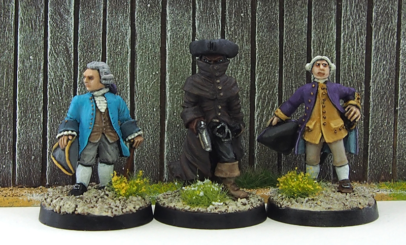
January 23, 2017Port George finally has a crown-appointed governor and I have my first painted minis of 2017! I finished painting a trio of miniatures I started in late 2016, representing the governor, his son and their manservant. All three are from different manufacturers, with the governor being a Front Rank gentleman, his son a Galloping Major sailor character and the manservant a Black Cat Bases bounty hunter.
Click for a larger version
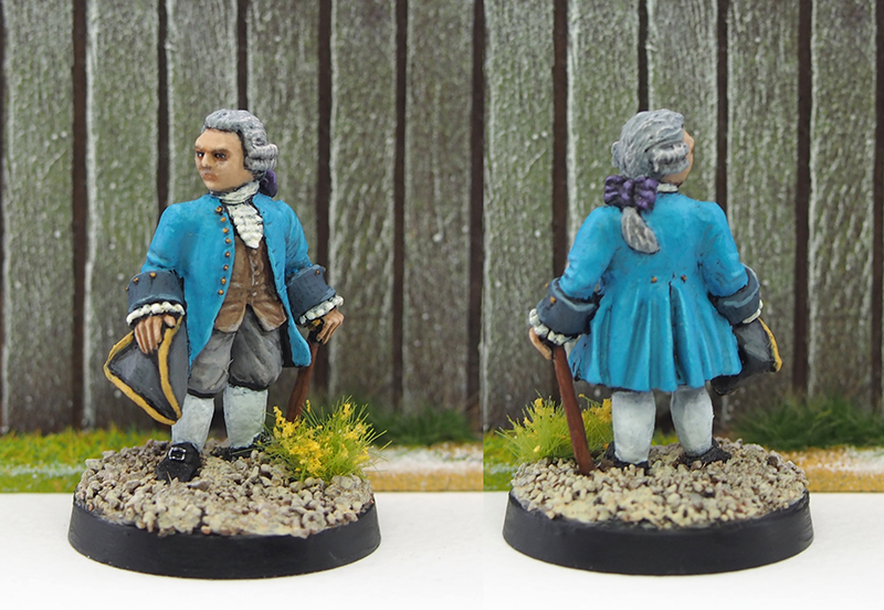
Governor Weatherby is a classic, stylish gentleman. I’ve yet to decide whether he’s a governor of the pirate hanging type or the pirate embracing type. The mini was good fun to paint. I went for a bright blue for the jacket, but otherwise kept the palette fairly muted. I wanted the governor to look well-off but not ostentatious, leaving the latter for his son. Being a Front Rank miniature, he is fairly small, but I think that actually works quite well here, as it does make him look a little older. That’s also why I decided to make his hair grey.
Click for a larger version
I wanted the governor’s son to be something of a foppish dandy, so I gave him a purple jacket combined with a yellow waistcoat. The emerald green bows on his plait and hat add even more touches of colour, and obviously all of his button are bright brass. I botched painting his left eye, and decided to make it into an expression. I think the end result makes him quite characterful, as he is glancing sideways somewhat nervously and reaching for his sword. The expression, the large hands and smallis head make him look young and awkward, which is exactly what I wanted. Well, initially I didn’t know that it was exactly what I wanted, but I love the end result.

Click for a larger version
Stylistically the manservant, Mitchell, is an entirely different case from his employers. “Manservant” is obviously just a polite expression for “bodyguard and muscle”, and the mini’s huge size (typical of Black Cat Bases sculpts) works in this regard. I’ve always loved the look of a greatcoat with the collar up, so this was a real treat. I wanted Mitchell to look properly badass, so I kept the colours dark with the exception of the boots and the pistols. For some extra diversity and to spark the imagination regarding his background, I gave him dark skin. I’m really happy with the greatcoat and the miniature in general, I think he looks hard as nails.

Click for a larger version
I had a lot of fun painting these three, as they’re all very different both in style and colour scheme. While the governor and his son are really bright and colourful, their servant is dark and menacing. As it is, I think these three minis manage to create a nice little narrative. It’s stuff like this that really keeps up my enthusiasm and motivation for a project! These three have been waiting for me to finish them for a while, so finally getting them done is extra rewarding to boot.
I’ve been thinking that I need to improve my painting. While I’m fairly happy with my basic level, I tend to get lazy with thinning paint, layering and blending. I think there’s plenty of space for improvement there. Of course taking massive closeup photos of minis doesn’t help either! Feedback on this front much appreciated.

Nice work, and usually the hanging types are secretly consorting with the pirates behind the scenes!
LikeLiked by 2 people
Indeed, it might be a question of which pirates to hang to ensure easy business dealings.
LikeLiked by 1 person
Very nice group mate, and I think your painting is fine! I think the manservant suffers a bit on the colour choice though – the skin & coat are too close in tone for my taste… the obvious would be paler skin, but I really like that skin tone, so I’d be tempted to do the coat green or something. That’s just me mind, and certainly no criticism of your painting technique 😉
LikeLiked by 1 person
Thanks for the comment Alex! I did think about the same thing myself, but in the end I liked both the coat and the skin colour, and didn’t want to compromise on either 😀
LikeLiked by 1 person
Fair enough mate – still looks great! 😉
LikeLike
Excellent. I’m fast become an addict to your posts. I love the theme the setting and the models are great. I think your painting is spot on. The darkness and size of Mitchell makes him a very ominous character indeed. I like the “foppish dandy” too haha. Please sir I want some more.
LikeLiked by 1 person
Thanks for the kind words! I’ll do my best to get some more stuff out there.
LikeLiked by 1 person
Hehe no pressure I’m just really enjoying your posts. You, like me, seem to enjoy giving each mini a name and a character and the whole town thing has me captivated and inspired.
LikeLiked by 1 person
So nice to hear that. The narrative is definitely an important part and it really helps me paint.
LikeLiked by 1 person
Ditto my friend. I’m not sure if you saw my posts called The Crooked Man but, an ongoing saga. You might like some of the minis.
LikeLiked by 1 person
Man, how had I missed those? Just read them all and I want more! Is it a campaign (i.e. game reports) or simply a narrative?
LikeLiked by 1 person
Hehe thanks mate. Just a little story inspired by the Crooked Man poem.
LikeLiked by 1 person
These are great.
The bodyguard oozes menace.
LikeLiked by 1 person
Thanks Paul! Happy to hear others agree with the look.
LikeLike
Impressive as always! I like the vibrant colours, and the manservant’s a great contrast to the other two. Very nice work!
LikeLiked by 1 person
Thanks Mr. Shandy! The colours were a joy to paint, it’s fun to occasionally use colours that are normally not found on my minis. The combination of purple and yellow is a particular favourite!
LikeLiked by 1 person
Nice work here. They make a well-thought out narrative trio.
LikeLiked by 1 person
Thanks Azazel! Glad you like them.
LikeLike
Very nice trio.The blue cloak looks excellent. Vibrant, yet smooth and good contrast. The bounty hunter reminds me of a movie…I think it had to do something with the beast of Gevaudan. Very menacing. The red-brown also gives the cloak some complexity, which works well with the white of the eyes.
LikeLiked by 1 person
Thanks for the kind words! Good call on the movie too, as The Brotherhood of the Wolf has indeed been a major inspiration. I think that’s where I fell in love with the raised collar greatcoat look.
LikeLike
That is the one. Yes, that look is extremely cool.
LikeLiked by 1 person